i wrote a few weeks ago about my new smart art subscription box and how much fun i was having. i have even roped [child_1] and [child_2] into the experience… kicking and screaming i might add. but once they finished their projects they were very pleased with what they had accomplished. tangent: i don’t understand that… they have been complaining about boredom since last april when the lockdowns began. i get that pandemics are exceedingly stressful and yet at the same time profoundly boring but we have soooo much to do! omg… sigh.
each of the smart art projects comes with prompts for the techniques and this one was: pattern, donut, seahorse and crystal… i have not been able to do the crystal yet but i have decided on skyrim soul gems.
so here are my doughnut results:


i used the markers as actual markers this time and not like watercolors. i was pleasantly surprised by the results and we went on to make a whole box of donuts in all sorts of colors and shapes. purple donuts, green donuts, stripe-ee donuts. we got a pad of marker paper and mixed media paper from the local craft shop to accommodate our new donut enterprise. it is interesting to see the results on different types of paper, including some sketchbook papers.
just as an aside, paper really does make the project. you should have the right paper for what you are doing. i used to think it was just snobbery or a way for companies to fleece you because: paper?!? but it actually makes a huge difference. in some cases it can ruin your project and turn you off to the area you are trying to explore… the perfect example is markers. they bleed, they change colors, they tear up paper not designed for them. if you sat down with a pack of printer paper or even just some card stock and tried to do this project you might never use markers again. the paper would literally disintegrate while you were using it. you don’t have to spend top dollar but try to find something specifically designed for the medium you want to try.
the next project i tried was more ambitious. it was the seahorse. there are dozens of cartoonish images online i could have used as reference or some weird zendoodle things but i wanted a real seahorse. i thought about a leafy seadragon because, i mean seadragon. but it is technically not a seahorse… so i went for the disgustingly cute pygmy seahorse.
i used the most perfect image by chie imamura for this.
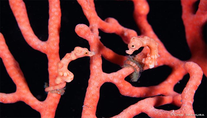
i think the little one on the left is asking the one on the right for some more phytoplankton and the one on the right is insisting that there isn’t any more, promise…

once i got the drawing on my marker paper i decided to try my prismacolor markers. i got them years ago and never really used them much. this is, after all, what they are designed for. so i thought – what the hell!


i know that it could be more detailed and there are elements that i can add to it but honestly i am afraid of making a mistake at this point and either having to start all over or just give up because “i ruined it.” i am too happy with my results right now to risk that. maybe instead of adding to this one i can do another one and try for more detail.
it was also the first time i ever really used my prismacolors for what they were designed to do. i think that is not too shabby for a first time. i was pleasantly surprised. i don’t think that markers are ever going to be my go to art medium but it was fun to learn how to use them properly and get intended results instead of sloshing things around and wondering why the f**k none of it looked right.
i had a moment when i realized that we don’t teach people how things work anymore, or at least not often. everything is about “feeling” and “using creativity to guide you” (can you smell the patchouli?)… but art has never been just about “feeling.” it has historically been about mastery of a medium and skill in your craft.
If you know anything about how much pigment used to cost – you know they didn’t let anyone just “intuit” with an ultramarine blue. we have that luxury today but learning how to use a medium is still very important. this experience with the smart art box helped me on my way to that goal. creativity and feeling have their place, i believe that strongly, but there is no substitution for skill and experience with your medium.
ahem.
#me gets off soap box.
please also note i am not sponsored by any products i use but if the yarka/st petersburg people are reading you can contact me anytime.
